Feb 14, 2012

Coloring Robot in Photoshop - Tutorial

Digital Art Tutorial Recommended for Intermediate Level Photoshop Users
As you will see, it is actually quite a simple Adobe Photoshop technique, but the results can be very effective! The workflow shown below is a good way to give an image the added dimension needed to convey shape and form.
Remember this tutorial is designed for intermediate level Photoshop users, so I will not bog down the page with explanations on how to do every little function. If you are not very experienced in Photoshop, I suggest that you go through Melissa’s Colouring Line Art tutorial first.

Colouring Robot in Photoshop 1

1) Line Art

Scan your line art into Photoshop. Zoom right in and clean up any untidy areas. Finally desaturate and adjust the curves on your image to ensure that your lines are indeed black and the white is indeed white. This technique is explained in detail here.
The image above is my line art once it was cleaned up. I named this layer “LineArt”.
Colouring Robot in Photoshop 2

2) Base Colour

Next I created a new layer beneath the line art and gave it a nice tan colour. This just gives it a bit more life and be any colour you want.


I changed the “Line Art” layer to multiply mode. This effectively renders the white of the “line art” layer transparent. Now we can see the adjustments you make to the layers beneath without affecting the line art layer. I called this layer “BaseColour”.
Colouring Robot in Photoshop 3

3) Silhouette

Next I create a new layer and filled in the shape of the robot with a solid colour, and named this layer “Silhouette”.
 

 This layer will not be visible, but serves a couple of purposes. The first, is keeping the shaded values we are about to add within the lines. This enables a free and fast way to lay down the tones. The other purpose, is that eventually we will use this layer to form the shadow.
Colouring Robot in Photoshop 4

4) Dark Tones

With the “Silhouette” layer visibility turned off (click the eye icon beside the layer) we need to select this shape. From top menu,
Select >> Load Selection
(Ctrl-click on the “Silhouette” layer in the “Layer Window” in old versions of Photoshop CS and earlier).
With this area selected we won’t be able to draw over the lines. Next I create a new layer, and used a fairly dark colour to loosely lay in the darker areas of the robot. I named this layer “DarkTones”.
Colouring Robot in Photoshop 5

5) Mid Tones

I created another layer beneath the DarkTone layer. I used a slightly lighter shade to bring in some mid tones. No prizes for guessing what I called that layer. Again just lay it in loosely.
Colouring Robot in Photoshop 6

6) Soften the Tones

I adjusted the transparency on both the DarkTone and MidTone layers and gave them a slight Gaussian blur. This blended the two shades together a bit more and lightened them up a bit.

Once that was done I merged the two layers together with the brown base colour. I named this layer “Base”. I know it looks rough at this stage, but it does get better. Honest.
Colouring Robot in Photoshop 7

7) Tone Detail

I gave the “base” layer a bit more depth by using both the Dodge and Burn tools. You can start to tighten up while using this method. Make sure you use a blurred brush not a solid one, or else you won’t get that nice blended effect.

Colouring Robot in Photoshop 88) Getting the Chrome Look


This is how it looks once all the adjustments are done with the Dodge and Burn tools. You can get that nice chrome, reflective look by alternating different values. An added visual aid is a bit of rim light added to certain areas. I placed it against a darker value to help make it stand out.


Colouring Robot in Photoshop 9

9) More Chrome Effect


To give it that little bit extra, I used the Dodge tool to highlight the rivets and edges of the plate lines. This helped to separate each plate and gave the image a bit more depth, not to mention the eye candy value.
Colouring Robot in Photoshop 10

10) Add Glow Effects

Once the main section of the image was completed, I went about adding little things to bump it up. One was the use of glow effects. These are done by using a blurred brush.

I also lightened up the far arm and leg to give that foreshortening look.
Colouring Robot in Photoshop 11

11) Robot Shadow

The shadow for the robot was the last step, and like the rest of this tutorial, was easy. All I did was duplicate the Silhouette layer, and flipped it over by going to Edit>Transform>Flip Vertical.

Colouring Robot in Photoshop 12

12) Fine Tuning the Shadow

I then adjusted the look of the shadow by going Edit>Transform>Distort. As you can see there can be problems with the shadow matching up, but a bit of fine tuning and depending on the results, a bit of editing with a brush, you can get it looking right.

Once you have it where it should be, give it a bit of a blur and drop the opacity down. As you can see the shadow is above the robot layer. To get rid of the sections over the robot area, we go back to the Silhouette layer. Again we Ctrl click the layer to select, and with the shadow layer still active we hit delete.

Colouring Robot in Photoshop 13The End


And here you have it, an easy tutorial. You can use this technique on any type of character you like, it is quick and looks good, and who can argue with that.
-Troy Packer

Dec 28, 2011

Glowing Light Effect Photoshop

this tutorial created by Fabio and posted in psd.tutsplus.com and i am resharing it here again. hope you all like it and enjoy Mr. Fabio's Tutorial.


Final Product What You'll Be Creating

In this tutorial I will show you an easy, and very fast way, to create a light painting in Photoshop.

Editor’s note: This tutorial was original published on Psdtuts in April of 2008.

Step 1

Create a new document and place the photo, you can download the one I used at: Photo 1.

Step 2

Here I placed a second image. I will use it to create the light effects. Here is the link for the next image: Photo 2.

Step 3

With the Pen Tool(P), create a path for one of the figures.

Step 4

Select the Brush Tool(B) and go to Window>Brushes or F5 to create our brush. Use 8px for the diameter and select Dual Brush and Other Dynamics. Follow the image below for reference.

Step 5

Go to the Layer Palette, create a new folder, and rename it to lights. After that create a new layer inside this folder, name it “dude”, and select it.

Step 6

Go to the Path Palette and select the first path. Then with the Path Selection Tool(A), select the path and right-click. Choose Stroke Path. A dialog box will open; select the brush and use Simulate Pressure.
After that go to Filter>Blur>Gaussian Blur, use 1.6px for the amount.

Step 7

Duplicate the “dude” layer three times.

Step 8

Select the Rectangle Tool (U) and create a rectangle. Then duplicate the rectangle several times. After that align and distribute them horizontally.

Step 9

Create a new layer inside the lights folder. Rename it to “xing”. Repeat Step 6 and Stroke the paths. After that select the “xing” layer and go to Edit>Transform>Distort. Now just move the vertices until the perspective is good—just follow the street lines.

Conclusion

That’s probably the easiest way to create this type of light effect; however, it depends on the color of the background. If the background is too dark, the blend mode won’t work. You’ll probably have to use another one with an Outer Glow.
You can make the lights brighter by just duplicating the layers. You can even use the Eraser Tool(E) to make some adjustments. The original concept image can be viewed at Light Graffiti In Photoshop. The final tutorial image is below.

Navigation Bar Tutorial Photoshop

this tutorial created by James Hewett in photoshoptutorials.ws, i like it most so published it here, hope you all like it...

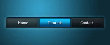
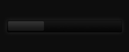
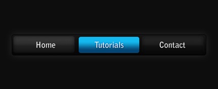
Preview of Final Results


Blue on black navigation bar

Blue on Black Navigation Bar Photoshop Tutorial


Step 1

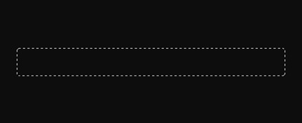
Firstly, create a new document - the size I've used is 540 by 220 pixels. Now for the background I've filled it with a black colour. To do this go Edit > Fill with the colour #0d0d0d.

Step 2

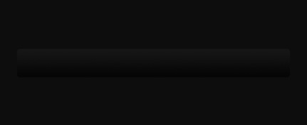
Secondly, we'll be making the background for the navigation buttons to go inside. Create a new layer (Layer > New > Layer) and select the rounded rectangle tool. Make fixed size selection of 480 by 50 pixels with a radius of 5 pixels in the middle of the document.
Fill this selection with a linear gradient from the colour #151515 to #050505 using the gradient tool. Deselect - Ctrl + D. Set the fill of the layer to 60% (the setting underneath the opacity in the layers window). The difference between opacity and fill is simply opacity changes the opacity of the entire layer and fill changes the opacity of everything except the layer styles.

Step 3

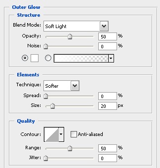
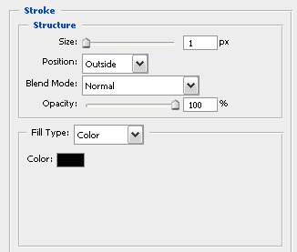
Now we'll be adding a couple of layer styles to this navigation background.
Layer > Layer Style > Outer Glow
Outer glow layer style
Layer > Layer Style > Stroke
Stroke layer style
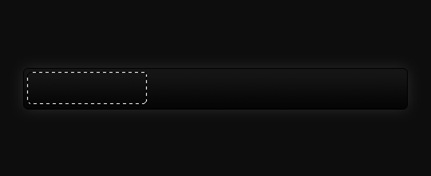
Now your document should be looking something like this.
Blank black navigation bar

Step 4

Next up we'll be adding in the buttons. Create a new layer and using the rounded rectangle tool again make a selection of 150 by 40 pixels (with a radius of 5 pixels again) on the left side of the navigation bar.
Fill this selection with a linear gradient from #323232 to #161616 using the gradient tool. Set the fill for this layer to 50%.
 

Step 5

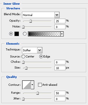
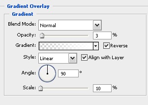
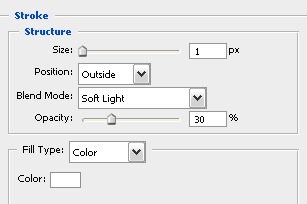
I've applied three layer styles to this button to give it some depth and make it look cooler.
Layer > Layer Styles > Inner Glow
Inner glow layer style
Layer > Layer Styles > Gradient Overlay
Gradient overlay layer style
Layer > Layer Styles > Stroke
Stroke layer style
Your navigation bar should now look something like this.
Black navigation bar with button

Step 6

Select the text tool and add in some text - the font styles that I have used for the text are Bell Gothic Std, Bold, 20 pt, Crisp, #ffffff.
Text added to black navigation bar

Step 7

Now repeat the button steps so you have two new buttons - I've decided that I'd make the middle one a different colour to stand out (this can be like a mouse over effect or something if you decided to code this navigation bar for a web layout). The blue colours I used for that are #14b9ef and #054573.
Blue accent button

Step 8

Because we have set the fill of the layers to 50-60% we can adjust the background and it can be half see through - below I've put a radial gradient with colours used in the vista theme.
Blue on black navigation bar